
|
|
|||||||
| IL-2 Sturmovik: Cliffs of Dover Latest instalment in the acclaimed IL-2 Sturmovik series from award-winning developer Maddox Games. |
 |
|
|
Thread Tools | Display Modes |
|
#1
 01-24-2011, 07:47 PM
|
|||
|
|||

|
|
#2
01-24-2011, 08:02 PM
|
||||
|
||||
|
I think most people here would actually disagree. Its too dull, there is no definition between the sea, cloud and the land. The planes look like cheap cgi, and God knows where the Spitfires spinner has gone. Another thing i'm not sure about, wouldn't you still be able to see the 109E's tailplane struts at that angle?
__________________
 XBL GT: - Robotic Pope HyperLobby CS: - Robot_Pope
|
|
#3
01-24-2011, 08:05 PM
|
||||
|
||||
|
Quote:
Poor artwork fully agree. Why not use a screenshot from the game, looks much better.
|
|
#4
01-24-2011, 08:12 PM
|
|||
|
|||
|
I'd probably say that the title is the worst part, I can overlook the artwork but the heading just looks tacky.
|
|
#5
01-24-2011, 08:17 PM
|
|||
|
|||
|
The sim community is utterly impossible to please, whatever you bring them they'll continue to moan and bitch about the most insignificant things possible. Heck i thought the RO community was pecky, but compared to the IL2 community its nothing...
|
|
#6
01-24-2011, 08:28 PM
|
|||
|
|||
|
Haha, the artwork isn't that bad, but the title still is.
|
|
#9
01-24-2011, 08:54 PM
|
|||
|
|||
|
Aha, yes.
|
|
#10
01-24-2011, 09:07 PM
|
||||
|
||||
|
At least they got rid of Storm of War; they might as well have called it Perils of Pursuit. It was just too corny.
I think they could have used a bit more imagination with the title though.
__________________
All CoD screenshots here: http://s58.photobucket.com/albums/g260/restranger/ __________ 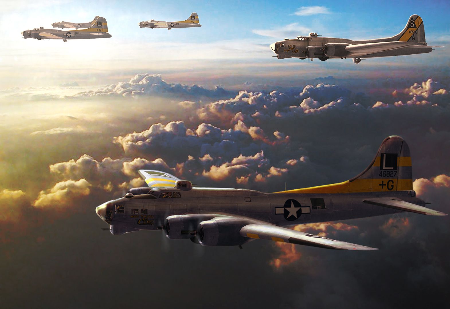 Flying online as Setback.
|
|
|
|


 Linear Mode

