Fulqrum Publishing Home   |   Register   |   Today Posts   |   Members   |   UserCP   |   Calendar   |   Search   |   FAQ

Go Back   Official Fulqrum Publishing forum > Fulqrum Publishing > IL-2 Sturmovik: Cliffs of Dover

IL-2 Sturmovik: Cliffs of Dover Latest instalment in the acclaimed IL-2 Sturmovik series from award-winning developer Maddox Games.

View Poll Results: Should the vegetation colours in CLIFFS OF DOVER be changed?
Yes: I would like to see a darker shade for the grass and other vegetation 226 75.33%
No: I am happy with the current colouring 74 24.67%
Voters: 300. You may not vote on this poll

Reply
 
Thread Tools Display Modes
  #91  
Old 04-09-2011, 07:32 PM
sigur_ros sigur_ros is offline
Approved Member
 
Join Date: Feb 2010
Posts: 74
Default


Trees need to be darker, almost black.
Reply With Quote
  #92  
Old 04-09-2011, 07:44 PM
mazex's Avatar
mazex mazex is offline
Approved Member
 
Join Date: Oct 2007
Location: Sweden
Posts: 1,342
Default

If they just add a gamma slider I guess it all would be fine... As it is now it's not that hard so tweak the gamma a bit before launching though... As usual...
Reply With Quote
  #93  
Old 04-09-2011, 07:47 PM
David Hayward David Hayward is offline
Approved Member
 
Join Date: Dec 2010
Posts: 1,183
Default

That "Rural Britain" photo was probably taken with a polarizing filter.
Reply With Quote
  #94  
Old 04-09-2011, 07:52 PM
Letum Letum is offline
Approved Member
 
Join Date: Mar 2008
Posts: 308
Default

Quote:
Originally Posted by mazex View Post
If they just add a gamma slider I guess it all would be fine... As it is now it's not that hard so tweak the gamma a bit before launching though... As usual...
nah, that would mess up the sky, cockpits, etc.
They are all fine.
Reply With Quote
  #95  
Old 04-09-2011, 07:56 PM
ChrisDNT ChrisDNT is offline
Approved Member
 
Join Date: Jun 2008
Posts: 298
Default

"If they just add a gamma slider I guess it all would be fine... "


I repeat it since so long, "add a gamma setting in the game setup", so simple, but it is perhaps too much simple as a solution !!!
Reply With Quote
  #96  
Old 04-09-2011, 08:48 PM
machoo
Guest
 
Posts: n/a
Default

Quote:
Originally Posted by *Buzzsaw* View Post
Salute

A lot of people have commented on the 'dayglo' look of the landscape in the game, there is a predominance of the type of lime green seen on hippie posters of the late '60's.

Anyone who has flown over England and France knows the real colours are much more muted and darker in tone.

What do you think?

Should the Developers adjust the greens towards the darker, more emerald side of the spectrum?

Or should they stay the same?
You can make the colors whatever you like by just adjusting them in the Nvidia ( or Ati ) controle panels. In the Nvidia controle panel under 'Display' under 'Desktpo settings' adjust the 'Digital Vibrance' slider. Mine is default at %50 - I moved it too %30. The colors are realistic now. You can't compare colors because everyones screen is different - it quite possibley looks completley normal on the developers screen too because they have the settings that are different to you.


See

Uploaded with ImageShack.us

Last edited by machoo; 04-09-2011 at 09:02 PM.
Reply With Quote
  #97  
Old 04-09-2011, 09:00 PM
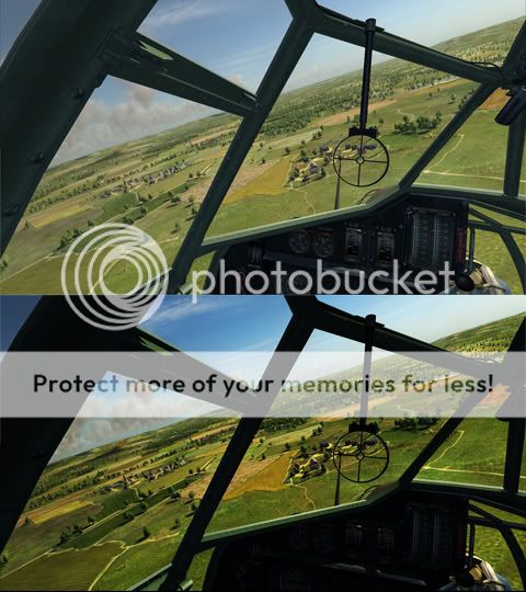
*Buzzsaw* *Buzzsaw* is offline
Approved Member
 
Join Date: Oct 2007
Location: Vancouver Canada
Posts: 467
Default

Quote:
Originally Posted by JG27_PapaFly View Post


Problem solved.
Your shots also illustrate why Oleg chose a low contrast per default: he found a good compromise that displays the sunlit landscape and important details hidden in shadows. The instruments are pitch-black in the high-contrast image. Our eyes have a dynamic range that is far greater than that of any machine. In real-life, sitting in a plane we see both the landscape and the instruments without problems, and without having the feeling that there is no contrast. To achieve this in a game, or in photography, you have to lower contrast. IMO Oleg did the right thing here.
Sorry, I don't see your solution solving the problem, in fact what you are doing is creating an unreadable set of instruments in the cockpit.

Look at how black the cockpit is in your shots.

The fact is, this is a game, there is no automatic iris adjustment possible for your eyes to make when you look down at the instruments. The gamma levels have to stay the same for both the exterior and interior.

In real life your eyes adjust to give a proper exposure. The game doesn't.

Which means to get a realistic exterior/interior balance, the developers need to tone down the exterior colours to represent what would be seen by the eye. Right now they are leaving them at the type of iris opening level which an eye adjusted for the cockpit would see. So they look overexposed and washed out.

Game needs to be adjusted.

By the way, the vote in favour of a change is now 3-1.
Reply With Quote
  #98  
Old 04-09-2011, 10:02 PM
reflected reflected is offline
Approved Member
 
Join Date: Mar 2010
Posts: 346
Default

France looks weird too. Here's a funny little comparison. It's amazing how one can find the exact some landmarks both in CloD and RoF!


Summer, same time of day (7:30 AM)
Reply With Quote
  #99  
Old 04-10-2011, 12:38 AM
rollnloop rollnloop is offline
Approved Member
 
Join Date: Feb 2008
Posts: 126
Default

For these particular screenshots, i find CloDo's more realistic, by far.

Strange because usually i find RoF more enjoyable to my eyes.
Reply With Quote
  #100  
Old 04-10-2011, 12:47 AM
ATAG_Dutch ATAG_Dutch is offline
Approved Member
 
Join Date: Feb 2010
Posts: 1,793
Default

Quote:
Originally Posted by rollnloop View Post
For these particular screenshots, i find CloDo's more realistic, by far.
Strange because usually i find RoF more enjoyable to my eyes.
I'm not sure whether it was the latest version update to RoF or an updated Catalyst driver for my card, but the colours in RoF seem to have been toned down a heck of a lot for some reason. I don't like it as much as how it was either.

Anyway, thought I'd upload this picture of some green English grass on a bright sunny day.
It was taken on my phone, but it really was this luminous.
Also a shot of the CoD landscape.
Just goes to show I suppose.
Attached Images
File Type: jpg Image0087.jpg (779.4 KB, 43 views)
File Type: jpg Launcher 2011-04-08 12-53-15-46.jpg (416.9 KB, 40 views)

Last edited by ATAG_Dutch; 04-10-2011 at 12:52 AM.
Reply With Quote
Reply


Posting Rules
You may not post new threads
You may not post replies
You may not post attachments
You may not edit your posts

BB code is On
Smilies are On
[IMG] code is On
HTML code is Off

Forum Jump


All times are GMT. The time now is 09:21 PM.


Powered by vBulletin® Version 3.8.4
Copyright ©2000 - 2025, Jelsoft Enterprises Ltd.
Copyright © 2007 Fulqrum Publishing. All rights reserved.