
|
|
|||||||
| IL-2 Sturmovik: Cliffs of Dover Latest instalment in the acclaimed IL-2 Sturmovik series from award-winning developer Maddox Games. |
| View Poll Results: Should the vegetation colours in CLIFFS OF DOVER be changed? | |||
| Yes: I would like to see a darker shade for the grass and other vegetation |
|
226 | 75.33% |
| No: I am happy with the current colouring |
|
74 | 24.67% |
| Voters: 300. You may not vote on this poll | |||
 |
|
|
Thread Tools | Display Modes |
|
#71
 04-07-2011, 05:41 AM
|
|||
|
|||
|
Here's one other issue: i see many have posted pics of the landscape in question, most of them taken with P+S cams.
I do lots of landscape photography as a hobby, above and underneath water. That taught me not only to calibrate my monitor, but also my camera! Determining the hue of the colors we see outside is a very difficult task. The only way a cam is going to record colors that are anywhere near the real colors is by shooting in raw and developing the files in a raw editor that has been calibrated for your specific cam (u do this by shooting a test chart and letting a calibration algorithm analyse the output). This essentially provides a calibrated cam. And there still is the issue of exposure: even with a calibrated cam, your colors will look very different if you over- or underexpose a little. P+S cams are very bad in this respect: not only are they inaccurate at recording colors, they also oversaturate the recorded colors by in-camera processing before tossing out an 8bit jpeg image with a narrow gamut. Oleg is a photographer, he knows of all these issues. I can clearly see that he worked really hard to get the looks right in this sim, and he deserves our respect for that. This truly is a piece of art and looks way better than anything out there, sim or not. What I'm trying to say is this: the matter is much more complex than anyone would imagine. You also want to find a setting that interacts well with the game engine itself, with the way it renders and with color range limitations. S! 
|
|
#72
04-07-2011, 07:27 AM
|
||||
|
||||
|
Quote:
|
|
#73
04-07-2011, 07:48 AM
|
|||
|
|||
|
If your colours are wrong fix your settings.
This was done using only Contrast and Saturation. And can easily be achived with most Graphics Cards control panel I've posted this before. The very right hand side of this pic is the original 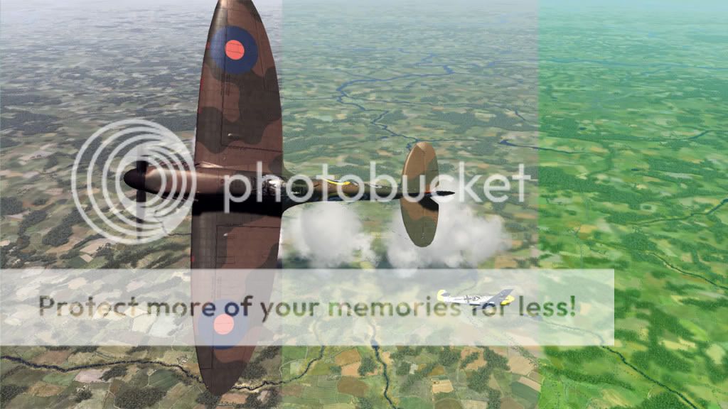 EDIT : Sorry it's the middle one that's the original, the right one has green channel turned up. Last edited by winny; 04-07-2011 at 08:43 AM.
|
|
#74
04-07-2011, 08:03 AM
|
||||
|
||||
|
Quote:
|
|
#75
04-07-2011, 08:33 AM
|
|||
|
|||
|
Quote:
First I grab a screenshot and open it in Windows then have the graphics properties window open at the same time so I can get it right without having to switch apps. It's not an exact science but my method is to take the colour out completely, increase the contrast so that things I know that are black in reality (Spitfire spinner for example) appear as black as possible without losing definition then gradually bring back the colour till you're happy. You're desktop will probably look like s**t when you're done but just save it as a profile. All this 'wrong colour pallete' stuff is not true. It's personal preference. These are a result of only touching the contrast. No colour changes at all 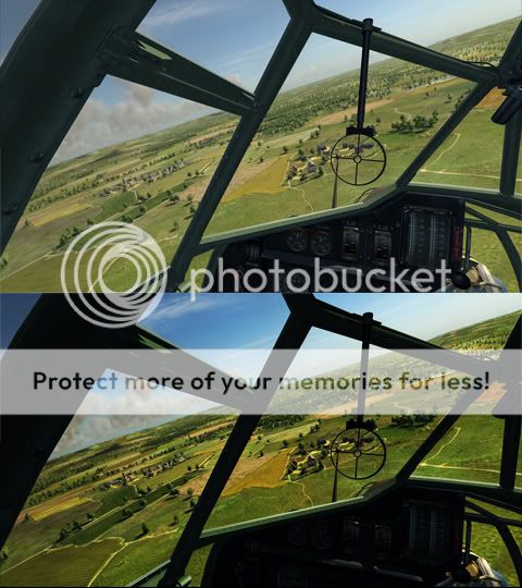 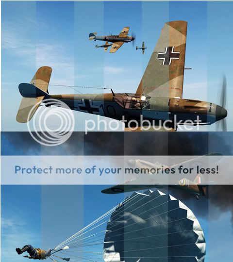 The lighter bands are the original. If you are happy with the way it looks then fine if not, tweak. Last edited by winny; 04-07-2011 at 08:42 AM.
|
|
#76
04-07-2011, 08:37 AM
|
|||
|
|||
|
I allways use in the nvidia control panel, the digital vibrance(saturation), i put it to the 30 %, then in the green chanel, i down the brightness to the 40% , i use abit more contrast too or less gamma.Try it, the game improves drastically.
|
|
#77
04-07-2011, 09:24 AM
|
|||
|
|||
|
Quote:
Your shots also illustrate why Oleg chose a low contrast per default: he found a good compromise that displays the sunlit landscape and important details hidden in shadows. The instruments are pitch-black in the high-contrast image. Our eyes have a dynamic range that is far greater than that of any machine. In real-life, sitting in a plane we see both the landscape and the instruments without problems, and without having the feeling that there is no contrast. To achieve this in a game, or in photography, you have to lower contrast. IMO Oleg did the right thing here.
|
|
#78
04-07-2011, 09:30 AM
|
|||
|
|||
|
The landscape looks very good , the greens need to be desaturated though.
|
|
#79
04-07-2011, 09:59 AM
|
|||
|
|||
|
Quote:
You're right about Oleg. It's a happy medium. People have different expectations of what they should see on a monitor. Some, because of the medium expect a photo-y version of the world on screen. You're wrong about the eye though. Look at a bright light and then stick something inbetween you and the light. It dosn't take a lot to get a silhouette. And even a bog standard camera 'sees' IR. My real point is that to have so many people vote saying it's wrong on a developers forum when in fact it's got more to do with how they are set up locally than the actual software seems a bit, well, pointless. Last edited by winny; 04-07-2011 at 10:13 AM.
|
|
#80
04-07-2011, 10:12 AM
|
|||
|
|||
|
As shown in the above pics, is one way to adjust the way you percieve how the land looks to you. The other is just use the game the way it was designed to and reflect terrain at differing times of day. The way we do in real life Aerial and Survey photography, Rule No.1: Sun Angle. Rule No. 2: Altitude... and a bunch of others I wont go into for fear of boring you all to death, all contribute to contrast on final images.. All the following screenies are in game shots with no monitor adjustments (only time of day changes). As a specialist Aerial Photo Navigator for the last 30 years I can say they (Devs) have made a pretty good replication of the way the terrain reflects the sun and reproduces the look. Here are examples of different times of day and hence different sun-angles reflecting back into virtual camera. Make sure you have your land shading setting on as well it makes a big difference.
Morning through to afternoon with default game time at the end      Nothing too garish or contrasty about those except for default maybe borderline. So have a play with the times of day and you will probably find all is ok Last edited by Macka; 04-07-2011 at 11:05 AM.
|
|
| Thread Tools | |
| Display Modes | |
|
|


 Linear Mode

