
|
|
|||||||
| IL-2 Sturmovik The famous combat flight simulator. |
 |
|
|
Thread Tools | Display Modes |
|
|
|
#1
 02-24-2011, 11:17 PM
|
||||
|
||||
|
Quote:
  
__________________
All CoD screenshots here: http://s58.photobucket.com/albums/g260/restranger/ __________ 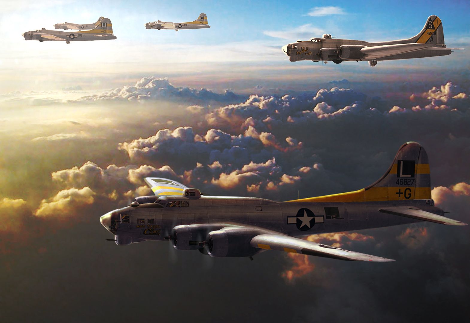 Flying online as Setback. 
|
|
#2
02-25-2011, 01:27 AM
|
||||
|
||||
|
Quote:
i hate to say it, but the bright greens in the foliage and trees just looks to fluro to me in some of the other screenshots posted (not the one under discussion here with the fields). lush brigh green is possible in the south of england, but not the fluro brightness we still have in some of those other ( non final ?) screenshots. the other colors look fine to me, it just the greens used for england that are to strong. then again, if the greens in some of the other screenshots taken by the same person look fine, maybe it is a lighting effect under certain angles or conditions that makes it appear to strong in some other screenshots. note: a few months ago we already had a 20 pg thread on this issue, no need to get sidetracked again Last edited by zapatista; 02-25-2011 at 01:30 AM.
|
|
#3
02-25-2011, 11:33 AM
|
|||
|
|||
|
The colours look fine to me,you see in top picture at the tail end of the a/c
theirs a field with a shadow of a cloud which make's the green look alot deeper.The bottom pic is way to dark,you can see this effect inside your own home even,look at your walls where sun light comes in if you have a wall in shadow the paint on the walls will look like two different shade's.The picture does not show overcast if it was the bottom picture would be the one i would like. Clear skies brighter colours, overcast deeper colours Last edited by t4trouble; 02-25-2011 at 11:36 AM.
|
|
| Thread Tools | |
| Display Modes | |
|
|


 Hybrid Mode
