
|
|
|||||||
| IL-2 Sturmovik: Cliffs of Dover Latest instalment in the acclaimed IL-2 Sturmovik series from award-winning developer Maddox Games. |
 |
|
|
Thread Tools | Display Modes |
|
#1
 01-04-2011, 03:03 AM
|
|||
|
|||
|
I believe that a great selling point for SOW:BOB (as with IL-2) is the great attention paid to historical accuracy and detail…aircraft modeling, flight modeling, damage modeling, aircraft armament, and a myriad of other details. I believe that many in the community will be expecting similar accuracy in matters relating to aircraft paint schemes, camouflage patterns, national markings, and tactical markings such as unit ID Codes, insignia, etc. Many IL-2 skinners have become expert in historical markings and have produced outstandingly accurate skins. A vast amount of information is available on such matters, free on the internet let alone in hard copy reference materials/books/etc.
In the interest of such historical accuracy, NOT to be nitpicking or unduly critical of all the work which has obviously gone into SOW:BOB, I offer the following observations/comments. I have seen the posts which mention that all the WIP updates we are seeing show only Works-in-Progress…and with regard to aircraft markings, I have seen posts saying that any errors noted are because the Skins are not final, just placeholders. Nevertheless, there seem to be some oddities (oft repeated/recurring ones) which I am sure the SOW team would not want to have slip through into the final Release version of SOW:BOB....and may, in fact, hint at some still incomplete research into historical facts/documentation. So…in a positive vein, I offer the following: Recent SOW:BOB update showing a Bf110 of Zerstorergeschwader 76, in this case the code letters indicating this would be the mount of the ZG76 II Gruppe staff adjutant  What it should look like...note the shark teeth, specifically, which were on all II./ZG76 110's from the Battle of France onward, and also the camouflage paint scheme...a scheme of multi-green colors specifically dictated by RLM rather than the later browns and other colors in various theaters:  Another recent BOB update...this 110 would have been the mount of the Zerstorergeschwader 26 Kommodore. All Luftwaffe geschwader Commanders and their Staff had their individual aircraft letter in Blue. The first letter is the aircraft, in this case "A"indicates it is the first acft of that unit, which would always be the Commander's acft. Its color is based on the unit/staff it belonged to; In this case the second "A" indicates it is of the Geschwader staff, so the first "A" should be geschwader's color Blue, not green. Green would be correct if it were from the staff of any of the three subordinate Gruppes, whose Unit ID (second) letter would be B,C, or D...never "A". Also, I do not believe that any 110's of any LW unit had the Code letters on the fuselage forward of the cockpit...that is a purely historically inaccurate placement. The BOB update screenie:  Here is a correct skin, with regard to the Code letters, for the ZG26 Kommodore...Also, by the time of the BofB, I believe all 110’s would have been using the Wide white bordered Balkenkruezen as shown in this Profile, not the Narrow white trim of the pre-war through 1939 timeframe.:  Again, note the difference between the Balkenkreuzen on the SOW:BOB screencaptures of 110’s M8+BC and 3U+AA and the balkenkreuz in the photo below…and also all of the profiles of ZG76 aircraft:  The same balkenkreuz detail arises with the JU-87’s: Recent SOW:BOB screenie:  Pre-war Stuka...note the balkenkreuz with narrow white trim/border:  1939 Polish front Stuka  Battle of Britain Stuka..note the wide border balkenkreuz::  Meanwhile, with the update Screenies of Spitfires, I've seen that the Code letters are not historically accurate in several respects..Serial numbers which are fantasy and have no basis and, in other cases, Serial numbers which were not of aircraft assigned to a certain squadron...etc... For example, this recent BOB update...No Spit with serial number L1126 ever existed (L series was from L1000 through L1096, according to sources I've examined in the past): ZP is definitely a correct unit Code (74Sqdn) but all aircraft ever assigned to 74Sqdn are known, and all L series Spits were, as i understand it, assigned to other RAF squadrons.  Also, as in the above screenie, almost all of the BOB Screenie Spits have the third letter unaligned with the first two, vertically above or below the first two. As far as I know, all RAF code letters were aligned, with the possible exception of just two specific squadrons (19 and 92). Below is another recent BOB UPdate...the Code letters and serial number are historically correct for 602Sqdn, but as you can see from the profile depiction further below, the three letters should be aligned.   Again, on an historical point, an update included this Screenie of a spitfire. It should be noted that JU were the code letters used by 111Sqdn, which flew Hurricanes not Spits (until April1941).:  Again, I offer the preceding comments in support of what I believe to be Oleg’s SOW team’s goal of producing an historically accurate Flight Sim, in all aspects. For the record, I am personally no expert but for a variety of reasons the matters which I have addressed above jump out at me, even though they might seem minor and insignificant to others. I hope they can be addressed and “tweaked” prior to the possibly imminent (relatively speaking) release of SOW:BOB. Had SOW been designed to be an all World-encompassing, all theaters, all units, all aircraft, all nations...ranging from 1939 through 1945, I would understand that there would be a need to 'average things out', not expecting perfection in every minute detail. However, since Oleg has wisely chosen to kick things off with a single "limited" theater/campaign....SOW:BofB is relatively small in terms of specific forces involved, well known and documented units and even individual aircraft....that I think such detail and near-perfection could be attainable. Respectfully and humbly submitted... 
|
|
#2
01-04-2011, 04:00 AM
|
||||
|
||||
|
From what I remember reading BoB allows the mission creator to type whatever serial numbers/apply whatever squadron codes they want. I imagine it is more going to be a question of whether the mission creator bothers. From the comments that team members have made it appears that the markings will generally be as accurate as people want to make them. How detailed the scope of this is remains to be seen, i.e. whether squadron letters and insignia can be edited and suchlike.
|
|
#3
01-04-2011, 04:22 AM
|
|||
|
|||
|
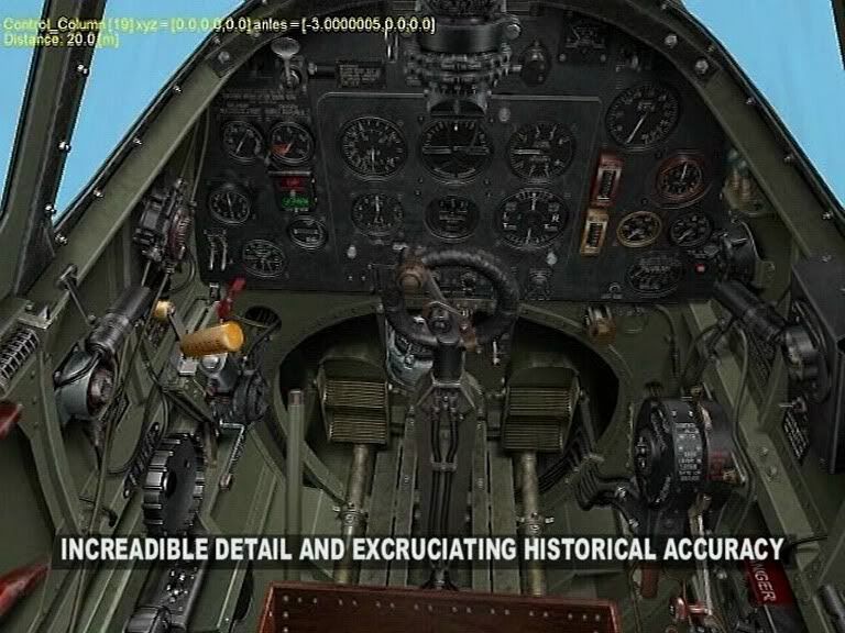
What part of "increadible detail and excruciating historical accuracy" didn't you understand?
|
|
#4
01-04-2011, 04:27 AM
|
|||
|
|||
|
Quote:
Surely BOB will include from the get-go a couple of Off-Line Campaigns which are very historically based and researched...including historically accurate skins, etc. Everything should not be left for 3rd party Mission/campaign creators to research and modify (sorry) to make accurate. With IL-2, it took a 3rd party person to create "Mat Manager" which provided historically correct tactical markings, varied insignia and markings by nationality and timeframes, etc... I can't recall the creator's name, but his contribution was invaluable to those of us concerned with historical accuracy and detail. Will SOW:BOB include the variety of historically researched markings for selection by the user, as did Mat manager? On another note, some of my comments/observations referred to placement/locations of certain markings/code letters...If the locations are wrong, then i assume the "skin Template' might be wrong and not allow the user to make an historically correct skin by himself. Hope I am continuing to sound positive, and supportive of Oleg's Team.
|
|
#5
01-04-2011, 04:30 AM
|
||||
|
||||
|
Yes, but there are development shots that are not necessarily from missions anywhere more detailed in scope than the QMB and therefore not necessarily with feverishly-researched markings. I agree it would be nice to see the sharkmouths/correctly sized Balkenkreuze, though.
|
|
#6
01-04-2011, 04:44 AM
|
|||
|
|||
|
Quote:
I tried very hard to make it clear that I am trying to offer positive suggestions for improvement on one facet of BOB. I never commented on any inaccuracies in the cockpit..that's not my forte or expertise or interest. Nor is the Cockpit relevant to the matter which I raised, which is aircraft national and tactical insignia and markings. I also made it Very Clear in the first sentence of my original post that "I believe that a great selling point for SOW:BOB (as with IL-2) is the great attention paid to historical accuracy and detail…aircraft modeling, flight modeling, damage modeling, aircraft armament, and a myriad of other details". What part of that statement didn't you understand, mate? FYI: The definition of "myriad" is: constituting a very large, indefinite number; innumerable; composed of numerous diverse elements or facets. Excruciatingly accurate cockpits are clearly a praiseworthy element or facet of BOB. Last edited by DoolittleRaider; 01-04-2011 at 04:49 AM.
|
|
#7
01-04-2011, 05:08 AM
|
|||
|
|||
|
Apart from the fuselage Balkenkreuz (which indeed needs to be the later broader type) I do not agree that SoW is going to be incorrect. As it is Ilya is the one taking screenshots and he simply did not bother to select the accurate combination of colours because he didn't have the time for it.
It will be up to the mission maker to select the proper colours and markings (since AFAIK any kind and colour combination can be used for any kind of unit, that solution seems to have been easier to code and allows greater flexibility for later marking changes). I most certainly provided Maddox Games with accurate information on camouflage & markings on the german units (except the bombers and recon units, which I could not finish due to real life issues).
|
|
#8
01-04-2011, 07:44 AM
|
|||
|
|||
|
Quote:
|
|
#9
01-04-2011, 08:46 AM
|
|||
|
|||
|
A very good post though Doolittle, It would be nice to see the correct paint schemes, but at this stage of the development its probably not that important, I would imagine these will be corrected later when the game is optimized etc.
|
|
#10
01-04-2011, 04:05 PM
|
|||
|
|||
|
Doolittle, whilst in broad agreement with your proposals, I have to say that your "catholic" rules regarding Spitfire lettering are a bit over the top, given that these were applied locally by groundcrew to comply with some broad interpretation regarding aircraft identification, (The Air Ministry or Duxford may know what these were).
If you look at the photographs here: http://www.spitfireperformance.com/spit1vrs109e.html you will see that you will need to add other squadrons to those of 19 & 22, which had stepped lettering. Even those squadrons which had even lettering, had aircraft within them with slightly eccentric application, probably due to time constraints or inexperience of the lad that painted them on. I suspect that if it could be clearly read, it got passed as ok. If you wish to enforce rules then please supply photographs of the aircraft of every squadron that flew Spitfires (and Hurricanes!), and for each month of the battle as it's likely that markings varied over the months, (replacement aircraft being painted by different people as one example). Photos of warbird repaints and pretty profiles will not do if accuracy is your aim. Yours constructively.
|
|
| Thread Tools | |
| Display Modes | |
|
|


 Linear Mode

