
|
|
|||||||
| IL-2 Sturmovik The famous combat flight simulator. |
 |
|
|
Thread Tools | Display Modes |
|
|
|
#1
 01-02-2011, 05:26 PM
|
|||
|
|||
|
Quote:

|
|
#2
01-02-2011, 07:20 PM
|
|||
|
|||
|
Oleg....I admit this is one of those detail posts...and i half appolgise for it...In the shot with the 109 having been shot down we have a really nice pic of a town...it looks great (here's the but) but 95% of the house have a clay red roof. we have a lot of Slate (very dark grey) roofed properties (particually pre 1940) in the UK. The only reason i bring it up is it may actually help break up the sea of brownish-red...sorry for my first...i'm going to be anal about detail post: it is meant with the best intentions.
edit: quick example: http://www.shutterstock.com/pic-5086...oof-tiles.html Last edited by leggit; 01-02-2011 at 09:17 PM.
|
|
#3
01-02-2011, 08:01 PM
|
|||
|
|||
|
Quote:
|
|
#5
01-03-2011, 12:11 AM
|
||||
|
||||
|
I don't mind a bit of variation in the colour of the roundels.
This is a screenshot from a few weeks ago. The colours here look perfect to me. 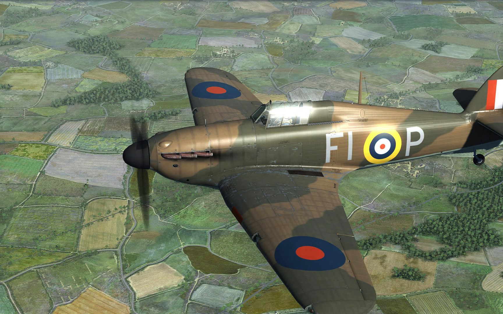
__________________
All CoD screenshots here: http://s58.photobucket.com/albums/g260/restranger/ __________  Flying online as Setback.
|
|
#7
01-03-2011, 12:10 PM
|
||||
|
||||
|
Quote:
|
|
| Thread Tools | |
| Display Modes | |
|
|


 Hybrid Mode
