Fulqrum Publishing Home   |   Register   |   Today Posts   |   Members   |   UserCP   |   Calendar   |   Search   |   FAQ

Go Back   Official Fulqrum Publishing forum > Fulqrum Publishing > IL-2 Sturmovik: Cliffs of Dover

IL-2 Sturmovik: Cliffs of Dover Latest instalment in the acclaimed IL-2 Sturmovik series from award-winning developer Maddox Games.

View Poll Results: Landscape colors new patch vs old
I like the new beta patch landscape colors 96 82.05%
I prefer the old beta patch landscape colors 21 17.95%
Voters: 117. You may not vote on this poll

Reply
 
Thread Tools Display Modes
  #11  
Old 10-06-2011, 11:14 AM
chiefrr73 chiefrr73 is offline
Approved Member
 
Join Date: Jun 2010
Posts: 68
Default

Hi all,
I m not installing betapatches, so could some of you please post videos of new betapatch, so I/other peoples who don t install can judje and tell their opinions. Thanks
Reply With Quote
  #12  
Old 10-06-2011, 12:30 PM
JG5_emil's Avatar
JG5_emil JG5_emil is offline
Approved Member
 
Join Date: Jul 2010
Posts: 331
Default

Quote:
Originally Posted by RCAF_FB_Orville View Post
'New' landscape colour tweaks are an abomination.......'Return to the LSD valley of Shrek'. Previous beta much nearer the mark and was moving in the right direction. Contrast in cockpits is IMO overdone.

Honestly, just awful IMO. Does not inspire confidence, if they are 'reasonably happy' with this....that scares me.
+1

I find this a major step backwards!
Reply With Quote
  #13  
Old 10-06-2011, 02:07 PM
150GCT_Veltro's Avatar
150GCT_Veltro 150GCT_Veltro is offline
Approved Member
 
Join Date: Oct 2007
Posts: 274
Default

I don't like at all CoD's landscape but for the first time for me, colors look quite good. However i hope for a third party addon for the future, as we haven now for FSX. The same for the clouds.
Reply With Quote
  #14  
Old 10-06-2011, 03:55 PM
philip.ed's Avatar
philip.ed philip.ed is offline
Approved Member
 
Join Date: Jun 2008
Posts: 1,766
Default

+1 to Orville. These colours are nothing like England. Clearly there a ton of completely uneducated, blind individuals taking part in this poll. Regardless of aesthetic clarity, the colours are so far off it's laughable. England isn't like a multi-coloured patchwork quilt. Grass colours may vary lightly, but you won't look over your fence and see vivid, dark green grass in your neighbours lawn when yours is yellow and sun-bleached. In England, field patterns are fairly ordered and even. It's rare to see field layouts looking like some colour-blind God chucked a load of sprinklies over the terrain.
Reply With Quote
  #15  
Old 10-06-2011, 04:01 PM
Trooper117's Avatar
Trooper117 Trooper117 is offline
Approved Member
 
Join Date: Feb 2010
Posts: 309
Default

Quote:
Originally Posted by philip.ed View Post
+1 to Orville. These colours are nothing like England. Clearly there a ton of completely uneducated, blind individuals taking part in this poll. Regardless of aesthetic clarity, the colours are so far off it's laughable. England isn't like a multi-coloured patchwork quilt. Grass colours may vary lightly, but you won't look over your fence and see vivid, dark green grass in your neighbours lawn when yours is yellow and sun-bleached. In England, field patterns are fairly ordered and even. It's rare to see field layouts looking like some colour-blind God chucked a load of sprinklies over the terrain.
You can't tell em ed.. some of em don't even live here in the UK, most have never seen the south of England from several thousand feet or lower..
Reply With Quote
  #16  
Old 10-06-2011, 04:38 PM
JG52Krupi's Avatar
JG52Krupi JG52Krupi is offline
Approved Member
 
Join Date: May 2008
Posts: 3,128
Default

Quote:
Originally Posted by philip.ed View Post
+1 to Orville. These colours are nothing like England. Clearly there a ton of completely uneducated, blind individuals taking part in this poll. Regardless of aesthetic clarity, the colours are so far off it's laughable. England isn't like a multi-coloured patchwork quilt. Grass colours may vary lightly, but you won't look over your fence and see vivid, dark green grass in your neighbours lawn when yours is yellow and sun-bleached. In England, field patterns are fairly ordered and even. It's rare to see field layouts looking like some colour-blind God chucked a load of sprinklies over the terrain.
I agree with the colours being too pastel thought not as bad as they were pre beta, but seriously the highlighted part LMAO im not too sure if your from the UK now.... the fields over hear are NOT orderly or even and the different colours could be attributed to the different kind of stuff they were growing then.

http://maps.google.co.uk/?ie=UTF8&ll...h&z=14&vpsrc=6

Some places even most just random!
__________________


Quote:
Originally Posted by SiThSpAwN View Post
Its a glass half full/half empty scenario, we all know the problems, we all know what needs to be fixed it just some people focus on the water they have and some focus on the water that isnt there....
Gigabyte X58A-UD5 | Intel i7 930 | Corsair H70 | ATI 5970 | 6GB Kingston DDR3 | Intel 160GB G2 | Win 7 Ultimate 64 Bit |
MONITOR: Acer S243HL.
CASE: Thermaltake LEVEL 10.
INPUTS: KG13 Warthog, Saitek Pedals, Track IR 4.

Last edited by JG52Krupi; 10-06-2011 at 04:42 PM.
Reply With Quote
  #17  
Old 10-06-2011, 04:45 PM
Bpdslayer Bpdslayer is offline
Approved Member
 
Join Date: Apr 2011
Posts: 27
Default

So funny, we see so many people complaining about the new landscape colours, but the polls show that most of us like the new colours. Looks like the dissatisfied amongst us are the more vocal ones.

I for one prefer the colours in the new beta, they dont look so bright like pastel colours compared to before.
Reply With Quote
  #18  
Old 10-06-2011, 04:47 PM
fruitbat's Avatar
fruitbat fruitbat is offline
Approved Member
 
Join Date: Jan 2010
Location: S E England
Posts: 1,065
Default

Quote:
Originally Posted by philip.ed View Post
+1 to Orville. These colours are nothing like England. Clearly there a ton of completely uneducated, blind individuals taking part in this poll. Regardless of aesthetic clarity, the colours are so far off it's laughable. England isn't like a multi-coloured patchwork quilt. Grass colours may vary lightly, but you won't look over your fence and see vivid, dark green grass in your neighbours lawn when yours is yellow and sun-bleached. In England, field patterns are fairly ordered and even. It's rare to see field layouts looking like some colour-blind God chucked a load of sprinklies over the terrain.
Some of what you say is laughable.

I've just spent the last 3 months cultivating 3000 acres in south-east Kent, mainly driving this,


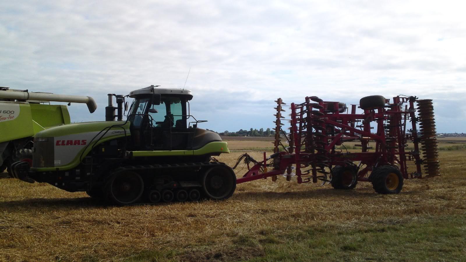
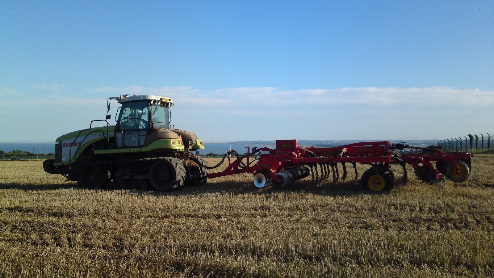
I'm now contact Avadexing all over south-east Kent, currently down on New Romney Marsh and must of driven over 6000 acres of fields so far this year in Kent, and can assure you the fields are definitely not fairly ordered and even.

Oh, and just for kicks this is from about 2 weeks ago,

over Caple Le fern,


Some picks from last week,


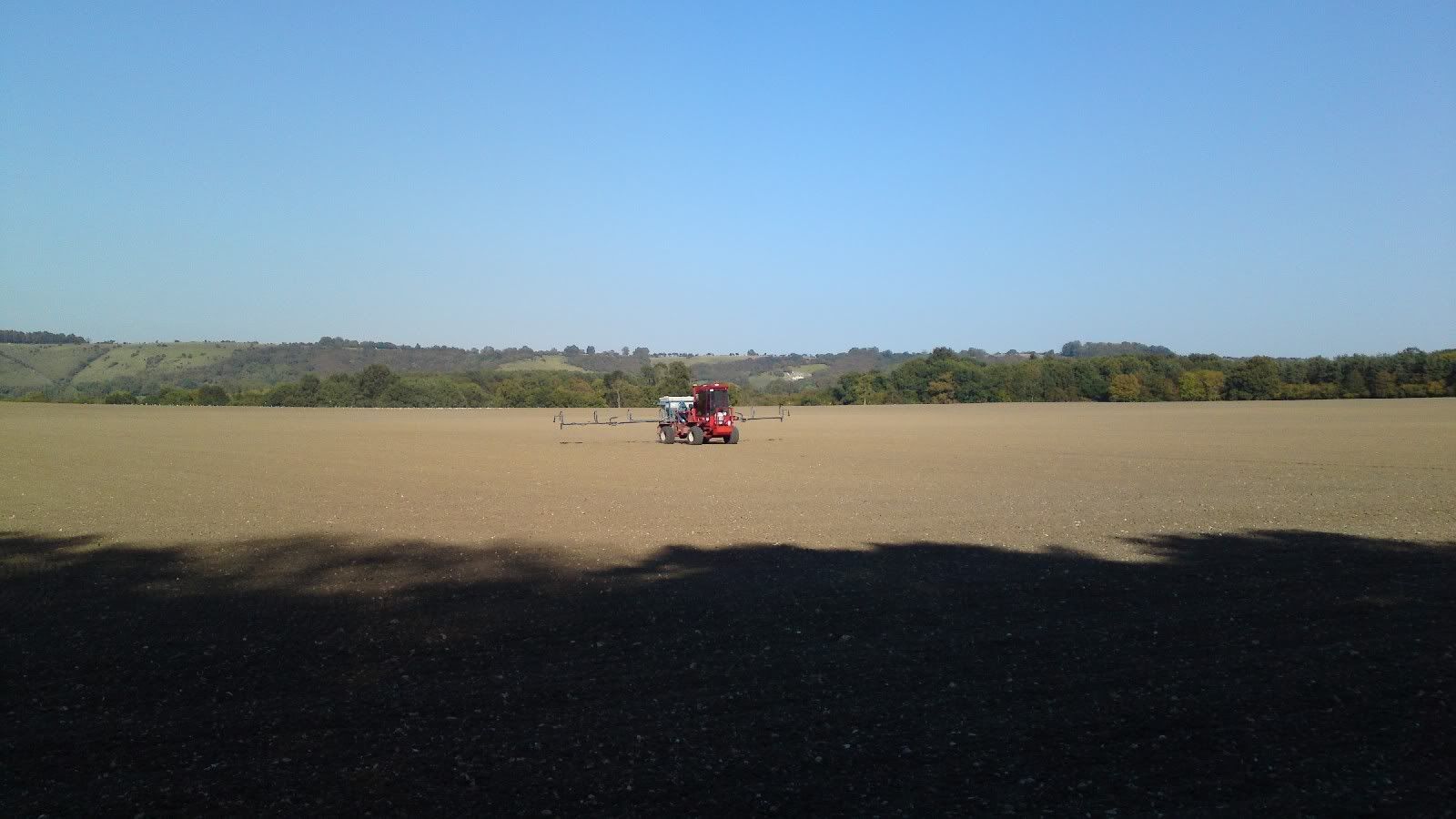
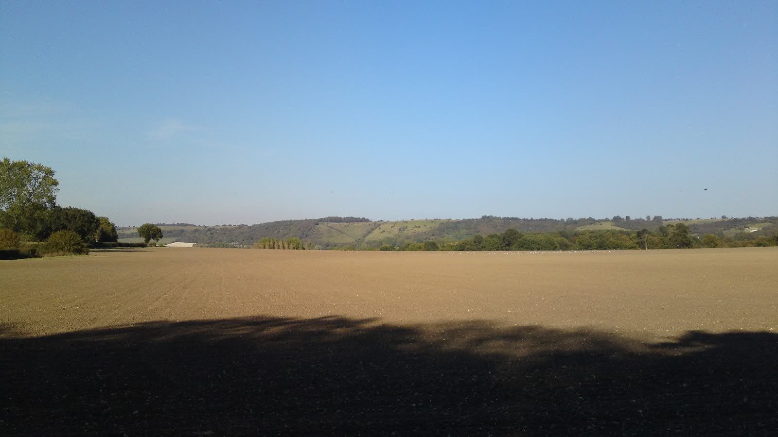
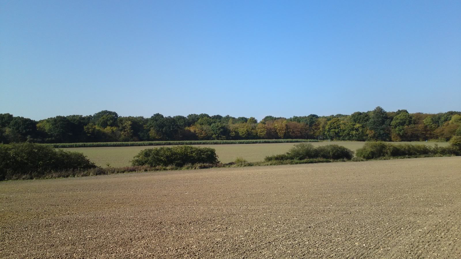
In my most humble opinion, i feel i'm probably more qualified than most to comment on the fields in south-east Kent.

Now as to the colours, well, i agree they're wrong, but they've always been wrong.

imo however they are the least wrong they've been so far.

However, it is impossible to create a map that represents how SE England looked during the BoB, simply because thats when the landscape is changing the most, the start of the battle the crops are beginning to ripen, and by the end, they've been harvested, and the fields re cultivated, so what 'time' do you pick?
Reply With Quote
  #19  
Old 10-06-2011, 05:00 PM
bw_wolverine's Avatar
bw_wolverine bw_wolverine is offline
Approved Member
 
Join Date: Jun 2010
Location: Toronto, Canada
Posts: 622
Default

Great pics and an informative post Fruitbat.

Agreed that they're still "wrong" but I can LIVE with it. To be perfectly honest, I could have lived with ANY version we've had so far. All of these colour/contrast debates are very nice to have and an interesting scholarly debate, but considering the kinds of terrain we've had in games we call classics and remember with reverence, the terrain we've had at all patch levels has been just fine for me.

Put it this way. Would you rather they continuously tweak the colours until they're just the way you like them, or would you rather that they search for and find a way to make the trees have collision detection. Or fix the comms. Or make the AI better. Or ANYTHING.

It's obvious the colours are never going to be perfect for everyone. Especially evident by this poll. I think enough time has been spent on the colours, though. Time for us all to say "okay, thanks for adjusting it, now move on to the next thing and return to this later if and when there's time to make further tweaks."

EDIT: Actually, now that I think more on it, we might have a lot of people voting that they like the new version simply because they want the devs to move on.
__________________
Pilot #1 (9:40 hours flying time, 3/0/1 Fighters, 7/2/0 Bombers). RIP

No.401 Squadron Forum


Using ReconNZ's Pilot Log Book

Last edited by bw_wolverine; 10-06-2011 at 05:03 PM.
Reply With Quote
  #20  
Old 10-06-2011, 05:08 PM
JG52Krupi's Avatar
JG52Krupi JG52Krupi is offline
Approved Member
 
Join Date: May 2008
Posts: 3,128
Default

Quote:
Originally Posted by bw_wolverine View Post
Great pics and an informative post Fruitbat.

Agreed that they're still "wrong" but I can LIVE with it. To be perfectly honest, I could have lived with ANY version we've had so far. All of these colour/contrast debates are very nice to have and an interesting scholarly debate, but considering the kinds of terrain we've had in games we call classics and remember with reverence, the terrain we've had at all patch levels has been just fine for me.

Put it this way. Would you rather they continuously tweak the colours until they're just the way you like them, or would you rather that they search for and find a way to make the trees have collision detection. Or fix the comms. Or make the AI better. Or ANYTHING.

It's obvious the colours are never going to be perfect for everyone. Especially evident by this poll. I think enough time has been spent on the colours, though. Time for us all to say "okay, thanks for adjusting it, now move on to the next thing and return to this later if and when there's time to make further tweaks."

EDIT: Actually, now that I think more on it, we might have a lot of people voting that they like the new version simply because they want the devs to move on.
Agree with everything you just said , but they are a little too bright.. I am fed up with neon nuclear green statements being shoved down my throat!!!
__________________


Quote:
Originally Posted by SiThSpAwN View Post
Its a glass half full/half empty scenario, we all know the problems, we all know what needs to be fixed it just some people focus on the water they have and some focus on the water that isnt there....
Gigabyte X58A-UD5 | Intel i7 930 | Corsair H70 | ATI 5970 | 6GB Kingston DDR3 | Intel 160GB G2 | Win 7 Ultimate 64 Bit |
MONITOR: Acer S243HL.
CASE: Thermaltake LEVEL 10.
INPUTS: KG13 Warthog, Saitek Pedals, Track IR 4.
Reply With Quote
Reply


Posting Rules
You may not post new threads
You may not post replies
You may not post attachments
You may not edit your posts

BB code is On
Smilies are On
[IMG] code is On
HTML code is Off

Forum Jump


All times are GMT. The time now is 07:25 PM.


Powered by vBulletin® Version 3.8.4
Copyright ©2000 - 2025, Jelsoft Enterprises Ltd.
Copyright © 2007 Fulqrum Publishing. All rights reserved.