Fulqrum Publishing Home   |   Register   |   Today Posts   |   Members   |   UserCP   |   Calendar   |   Search   |   FAQ

Go Back   Official Fulqrum Publishing forum > Fulqrum Publishing > IL-2 Sturmovik: Cliffs of Dover

IL-2 Sturmovik: Cliffs of Dover Latest instalment in the acclaimed IL-2 Sturmovik series from award-winning developer Maddox Games.

View Poll Results: Should the vegetation colours in CLIFFS OF DOVER be changed?
Yes: I would like to see a darker shade for the grass and other vegetation 226 75.33%
No: I am happy with the current colouring 74 24.67%
Voters: 300. You may not vote on this poll

Reply
 
Thread Tools Display Modes
  #111  
Old 04-12-2011, 07:14 AM
leggit leggit is offline
Approved Member
 
Join Date: Jan 2010
Posts: 108
Default

totally and utterly subjective discussion. colour particually within a light and landscape context is constantly changing....there are NO correct range of colours....given some of the photographic evidence being used to illustrate different points of view....a number of people need to go and get their eyes tested.

Last edited by leggit; 04-12-2011 at 07:24 AM.
Reply With Quote
  #112  
Old 04-12-2011, 07:40 AM
RocketDog RocketDog is offline
Approved Member
 
Join Date: Jan 2008
Posts: 134
Default

Quote:
Originally Posted by leggit View Post
totally and utterly subjective discussion. colour particually within a light and landscape context is constantly changing....there are NO correct range of colours....given some of the photographic evidence being used to illustrate different points of view....a number of people need to go and get their eyes tested.
I think it is not unreasonable to expect the game to attempt to reproduce what one sees with the naked eye when flying over the South of England. Arguments that if it doesn't, it's our fault, rather than that of the game are a bit contrived.
Reply With Quote
  #113  
Old 04-12-2011, 08:12 AM
ChrisDNT ChrisDNT is offline
Approved Member
 
Join Date: Jun 2008
Posts: 298
Default

The two screenshots of SigurRos are cruel !
Reply With Quote
  #114  
Old 04-12-2011, 08:16 AM
ChrisDNT ChrisDNT is offline
Approved Member
 
Join Date: Jun 2008
Posts: 298
Default

"there are NO correct range of colours"

Simple minds do not understand that if a boundary may be indistinct, it nevertheless exists.
Reply With Quote
  #115  
Old 04-12-2011, 08:27 AM
ATAG_Dutch ATAG_Dutch is offline
Approved Member
 
Join Date: Feb 2010
Posts: 1,793
Default

Quote:
Originally Posted by Gamekeeper View Post
11 pages and nobody has posted real life and COD side by side:


Excellent post if I may say so, and worth repeating.
Reply With Quote
  #116  
Old 04-12-2011, 08:57 AM
Katana1000S Katana1000S is offline
Approved Member
 
Join Date: Jan 2011
Posts: 247
Default

It does seem a bit too light/pastel shaded, but you cant argue with the picture comparison above I guess.

I've yet to see some of our dark dank miserable UK weather in the sim yet though, just enough to keep the aircraft flying and not grounded
Reply With Quote
  #117  
Old 04-12-2011, 11:04 AM
RocketDog RocketDog is offline
Approved Member
 
Join Date: Jan 2008
Posts: 134
Default

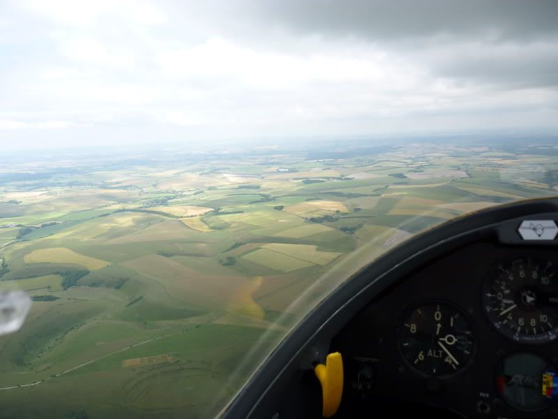
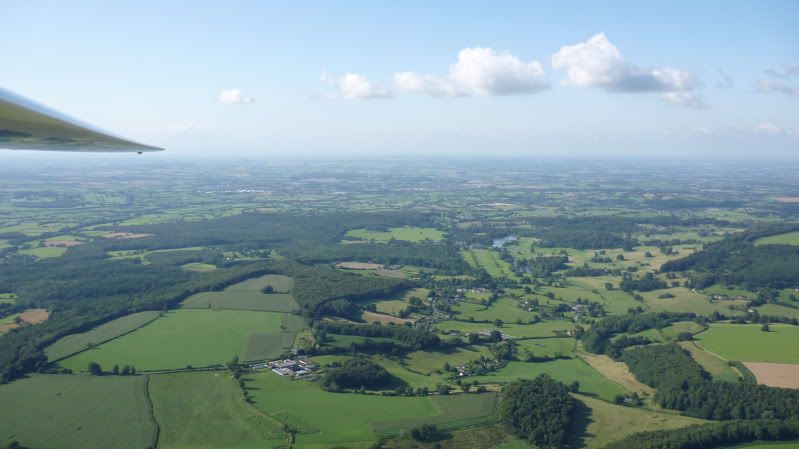
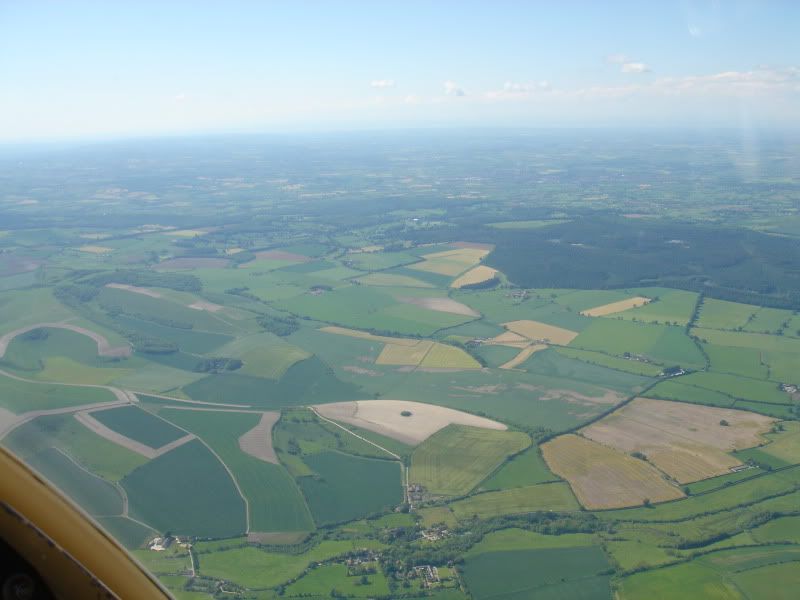
The majority of the field colours aren't bad, although I have never seen the "acid green" colour that CloD uses for a minority of fields. The main thing CloD gets wrong is the colour of the trees. If the game is meant to take place in the late summer months of the BoB, then the trees should look darker than the surrounding fields. You can see in the above screenshots that WoP gets it right, but CloD makes the trees too pale and bright. The effect is quite clear in these images of Wiltshire in summer taken from about 2,000' - 5,000'.


Reply With Quote
  #118  
Old 04-12-2011, 11:26 AM
ATAG_Dutch ATAG_Dutch is offline
Approved Member
 
Join Date: Feb 2010
Posts: 1,793
Default

Quote:
Originally Posted by Katana1000S View Post
It does seem a bit too light/pastel shaded, but you cant argue with the picture comparison above I guess.
Maybe this shows the real reason for the colour pallette.

See Wellington Bomber thread for how Biltongbru modified it to his liking.

Reply With Quote
  #119  
Old 04-12-2011, 12:35 PM
Friendly_flyer's Avatar
Friendly_flyer Friendly_flyer is offline
Approved Member
 
Join Date: Oct 2007
Location: Oslo, Norway
Posts: 412
Default

The Wellingtons look "good on film" (actually very good), but the South English countryside in august, looks a lot more lush. The film looks more apprpriate for a hotter and drier (Spanish?) climate.
__________________
Fly friendly!


Visit No 79 Squadron vRAF

Petter Bøckman
Norway
Reply With Quote
  #120  
Old 04-12-2011, 01:38 PM
David Hayward David Hayward is offline
Approved Member
 
Join Date: Dec 2010
Posts: 1,183
Default

Quote:
Originally Posted by sigur_ros View Post
Besides the desaturation, Wings of Prey gets very close to real.
You can't be serious. The WoP image looks like crap. Everything is puke green.
Reply With Quote
Reply


Posting Rules
You may not post new threads
You may not post replies
You may not post attachments
You may not edit your posts

BB code is On
Smilies are On
[IMG] code is On
HTML code is Off

Forum Jump


All times are GMT. The time now is 01:07 AM.


Powered by vBulletin® Version 3.8.4
Copyright ©2000 - 2025, Jelsoft Enterprises Ltd.
Copyright © 2007 Fulqrum Publishing. All rights reserved.